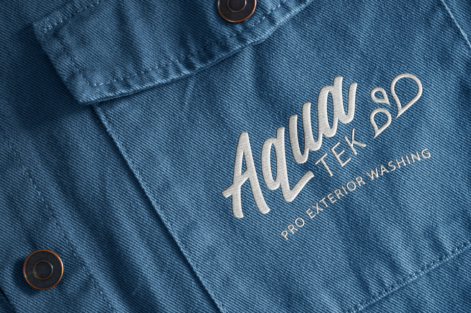
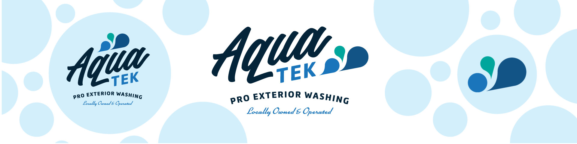
The Aquatek Pros wanted a “clean” logo that would channel the vintage charm of the 1950s to evoke a sense of old-school reliability. We tried to subtly hint at the concept of pressure washing without slapping pressure washing equipment all over the place. Its typography and refreshing color palette ensure versatility and reinforce the company’s commitment to quality and professionalism in the pressure washing arena.